
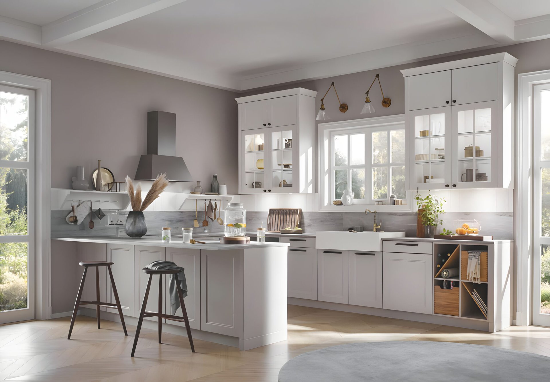
Most kitchen colour decisions go sideways for the same reason: people start with the fun part. They fall for a cabinet door in a magazine, paint a swatch on one wall, and try to build everything else around a single favourite. Then the floor fights the counter, the cabinets read green at noon and grey at dusk, and the whole room feels slightly off in a way nobody can name. The problem is rarely the colours themselves. It is the order they were chosen in.
A good kitchen colour palette is built, not picked. There is a sequence that designers follow almost without thinking, and once you learn it, choosing colours stops feeling like a gamble. This guide walks you through that sequence step by step, with a worked example you can follow from a blank room to a finished palette. We will also account for something every Metro Vancouver homeowner has to plan around: our soft, grey, low-angle coastal light, which changes colour selection more than most people expect.
Key Takeaways
- Start with what you cannot change. Floor, countertop, and fixed finishes set your direction before you choose a single cabinet colour.
- Lock your undertone first. Deciding warm versus cool early prevents the most common palette mistakes.
- Use the 60-30-10 structure. One dominant colour, one secondary, one accent gives a balanced, restful result.
- Test against your own light. Metro Vancouver’s cool grey daylight pulls colours bluer, so judge samples in your actual room across the day.
- A repeatable method beats inspiration. Follow the steps in order and the palette assembles itself.
Step 1: Gather Your Fixed Elements
Before you think about colour at all, take inventory of what is staying. These are your fixed elements: the things that are already in the room or already decided, and that you will not be replacing in this project. Typically that means the flooring, the countertop if you are keeping it, the backsplash, any exposed brick or stone, and large appliances if they have a strong finish like a warm stainless or a black slate.
Light is a fixed element too, and the one people forget. The direction your windows face, the time of day you cook and entertain, and the colour temperature of your overhead and under-cabinet fixtures all act on every other colour in the room. Note them down. A north-facing Yaletown kitchen and a west-facing kitchen in a house on the North Shore are working with completely different raw material, even with identical cabinets.
Write your fixed elements in a list and, where you can, gather a physical sample of each: a flooring offcut, a counter chip, a tile. This becomes your reference board. Every later decision gets held up against this board, which is how you keep the whole room speaking the same language.

Step 2: Choose Your Undertone, Warm or Cool
This is the single most important decision in the framework, and it is the one most often skipped. Every colour has an undertone, a quiet bias toward warm (yellow, red, brown) or cool (blue, green, grey). A white can be a creamy warm white or a crisp cool white. A grey can lean greige and warm or steel and cool. When undertones clash, a room feels uneasy even when each individual colour is lovely.
Look at your fixed elements from Step 1 and ask which way they lean. Oak and walnut floors, brass fixtures, and beige stone push warm. Polished concrete, marble with grey veining, and chrome push cool. Your undertone decision should generally follow your largest fixed surface, usually the floor, because it is the hardest and most expensive thing to argue with.
The 2026 trend cycle makes this easier than it used to be. Kitchen colour is moving firmly toward warm, complex neutrals such as soft mushroom, limestone, taupe, and clay, away from the cool whites and stark greys that dominated the last decade (John Lewis of Hungerford, 2026). Warmth also does practical work in our climate, which brings us to light.
Step 3: Account for Your Light Before You Commit
Metro Vancouver gives us a particular kind of daylight: cool, diffuse, and often grey for long stretches of the year. North-facing rooms anywhere have a cooler, greyer light with a subtle blue cast, because the sun strikes them low in the sky rather than head on (Benjamin Moore, 2025). Across much of the year, a lot of our city’s kitchens are effectively living in north-facing light regardless of which way they point.
The practical consequence is that cool undertones get amplified here. A grey that looks sophisticated in a sun-washed showroom photo can read flat, dingy, and cold in a Vancouver kitchen on a wet February afternoon. This is why so many local palettes that started cool end up feeling clinical. If you love grey, the fix is to choose a grey with a warm brown or beige undertone, a greige, which bounces the available light around and keeps the room feeling alive rather than chilly.
Build this knowledge into your undertone choice from Step 2. For most Metro Vancouver kitchens, nudging the whole palette a half-step warmer than you think you want will counteract the cool ambient light and give you a room that feels welcoming in every season, not just the three sunny months.

Step 4: Pick Your Dominant Colour (the 60)
Now you choose colours, and you do it using a proven structure. The 60-30-10 rule allocates roughly 60 per cent of the room to a dominant colour, 30 per cent to a secondary, and 10 per cent to an accent. It is the framework designers reach for because it produces a balanced, restful scheme almost automatically (Homes and Gardens, 2025).
Your dominant colour is the backdrop, the 60 per cent. In a kitchen that usually means the bulk of your cabinetry, or the cabinets and walls together. Because it covers the most surface area and is the most permanent, it should be the most restrained choice in your palette, and it must agree with the undertone you locked in Step 2.
This is where Bauformat’s finish range earns its place in the method. The Bauformat collection offers the widest choice of colours and finishes, which means you can land precisely on the warm neutral your light demands rather than settling for the nearest stock option. The Baulux collection brings the rich, deep colours and textured finishes for homeowners who want their dominant tone to carry real depth, while Burger covers the same logic at the best value. Whichever you choose, the dominant colour is committed to a hard, durable cabinet finish, so it is worth getting exactly right.
Step 5: Add Your Secondary Colour (the 30)
The secondary colour fills the next 30 per cent and creates contrast and interest against your dominant. In a kitchen this is often an island in a different finish, the lower cabinets when the uppers are your dominant, the wall colour, or a run of open shelving. Its job is to support the dominant, not to compete with it.
Choose a secondary that shares your undertone but differs in value or depth. If your dominant is a soft warm white on the perimeter, a mid-tone warm taupe or a muted clay on the island reads as intentional contrast rather than conflict. The two should look like they were chosen by the same person on the same afternoon, because in your method, they were.
This is also the natural moment to think about your fixed elements again. Your secondary colour is your best opportunity to echo something from the floor or counter, which ties the new colours to the things you could not change and makes the whole room feel resolved.
Step 6: Add Your Accent (the 10)
The final 10 per cent is your accent, and it is where personality lives. Because it covers so little surface, the accent can be braver than anything else in the palette: a saturated colour on bar stools, pendant lights, a backsplash detail, small appliances, or hardware. It is also the cheapest element to change later, so it can chase trends without committing you.
For 2026, golden, sun-washed yellows are emerging as a leading kitchen accent, prized for the way they amplify brightness and optimism in a space (House Digest, 2026). In a cool-lit Vancouver kitchen, a warm accent like this does double duty: it adds joy and it pushes back against the grey ambient light at exactly the points where your eye lands.
Hardware is a quiet accent that people underrate. The metal you choose for handles, paired with Bauformat’s 3D-adjustable concealed hinges and full-extension soft-close runners, sets a tone every time a drawer opens. Brass and warm bronze reinforce a warm palette; matte black grounds a cooler one.
Step 7: Test the Whole Palette Against Your Light
Before anything is ordered, test. Gather samples of all three colours plus your fixed-element references and live with them in the actual kitchen for at least two full days. Look in early morning, at midday, under your artificial lights at night, and crucially on a grey overcast day, because in Metro Vancouver that is your most common lighting condition, not the exception.
Move the samples around the room. A colour near the window behaves differently from the same colour on a shaded return wall. Watch for any sample that turns cold, muddy, or unexpectedly green as the light shifts. If something falls apart in your real light, this is the cheap, painless moment to swap it, long before it becomes a cabinet door.
A Worked Example, Start to Finish
Here is the framework applied to a real scenario: a north-facing kitchen in a Yaletown condo, the kind of cool, grey-lit space the whole city knows well.
Step 1, fixed elements: wide-plank warm oak flooring (staying), a quartz counter with a soft cream base and faint grey veining (staying), stainless appliances. Light is north-facing and cool nearly all year.
Step 2, undertone: the oak floor is decisively warm, so the palette goes warm. This also hedges against the cool light.
Step 3, light: because the room is cool-lit, we nudge every choice a half-step warmer than first instinct and avoid any blue-grey.
Step 4, dominant (60): perimeter cabinets in a warm limestone-beige from the Bauformat range, a soft neutral that holds its warmth even on an overcast day.
Step 5, secondary (30): an island in a deeper clay-taupe from the Baulux collection, echoing the warmth of the oak floor and giving the room a grounded centre.
Step 6, accent (10): warm brass hardware and a pair of sun-washed ochre pendant lights over the island, lifting the room against the grey light.
Step 7, test: samples sit in the condo for two days. The limestone-beige stays warm at midday and under evening light, the clay holds on a rainy afternoon, the brass glows. Nothing turns cold. The palette is approved and goes to order.
Five colours, chosen in order, each one earning its place. That is the entire method, and it works in any kitchen once you trust the sequence over the impulse.
Frequently Asked Questions
How many colours should a kitchen colour palette have?
Three is the reliable number, structured by the 60-30-10 rule: one dominant colour covering roughly 60 per cent of the room, one secondary at 30 per cent, and one accent at 10 per cent. Your fixed elements like floor and counter sit alongside these and inform them. More than three competing colours and a kitchen starts to feel busy rather than considered.
Should I choose warm or cool colours for a Vancouver kitchen?
For most Metro Vancouver kitchens, lean warm. Our coastal daylight is cool, diffuse, and often grey, which amplifies cool undertones and can leave a grey or blue palette feeling cold and flat for much of the year. Warm neutrals, or at minimum a greige with a brown undertone, counteract that light and keep the room welcoming in every season.
Does a new colour palette actually add value when I sell?
A well-chosen kitchen refresh is one of the strongest home investments available. A minor kitchen remodel returns about 113 per cent of its cost on average nationally, making it one of the strongest interior projects for ROI, according to the 2025 Cost vs. Value Report (Zonda, 2025). A cohesive, light-appropriate palette is a large part of why buyers respond to a refreshed kitchen.
What if I get my undertone wrong?
This is exactly what Step 7 protects you from. Testing real samples in your real light, including on an overcast day, catches an undertone mismatch while it is still free to fix. The mistake only becomes expensive when you skip the test and discover the problem after the cabinets are installed.
The reason this framework works is that it removes guesswork from a decision that usually runs on instinct alone. Fixed elements first, then undertone, then a dominant, a secondary, and an accent, all tested against the light you actually have. Bauformat’s range, made in Germany since 1917 and measured, planned, and installed by the local Vancouver team, gives you the breadth of warm finishes to land each step precisely where your room and our coastal light need it. Follow the sequence, trust it over the impulse to start with a favourite, and the perfect palette stops being luck and becomes a process you can repeat in any kitchen.
Explore more from Bauformat BC
- Transform Your Kitchen Mood With Powerful Colour Choices: a Design Guide
- Kitchen Colour Trends 2026: The Definitive Guide
- German Kitchen Design Inspiration for 2026
German cabinetry, planned and built for Metro Vancouver
The kitchen is one of the highest-return rooms in a home: the 2025 Cost vs. Value Report found a minor kitchen remodel recoups roughly 96% of its cost at resale. Choosing cabinetry that lasts is central to that return, which is where German engineering earns its place. Every Bauformat kitchen is manufactured in Germany, then measured, planned, and installed by our Vancouver team, built to fit your room to the millimetre.
See the Baulux, Bauformat, and Burger collections in person at 1410 Marine Dr Unit 205, North Vancouver, learn more about the manufacturer at bauformat.de.
Book a 30-minute consultation with our Metro Vancouver kitchen designers to plan a kitchen built to last.
